
I’m somewhat obsessed with the heights of people around me. I also have an interest in harmony and aesthetics. So I have been thinking what height proportions make a nice couple. If you are looking for a partner from the opposite sex (whether for a romantic relationship or for dancing), what height would be a good match to yours?
What follows is going to involve data analysis but there will be nothing inherently scientific about it. My proposal is not as much descriptive as imperative, and the imperative has no place in science. If one is looking for a partner, then there are many things hugely more important than the heights of people involved. So enjoy my argumentation, and take only as much with you as you like.
The point I’m trying to make might be argued in different ways. One can start off by assuming (for this argument only) that women look for tall men because women associate the height of men with strength and protection. A man might argue that a tall woman has had good nutrition in childhood and therefore is more healthy. Then it is natural to suppose that the tallest are in the best position to choose and they pair up with the tallest. The simply tall are left with the simply tall as their best option. People with average height prefer the average height to the short. And the short only have the short people to choose from. (I guess this is called a Pareto optimum, a situation where the allocation of resources is such that an improvement for any individual can only be achieved at the expense of deterioration for at least one other participant.)
I admit, the starting assumptions may well be oversimplified, the stuff of the popular press. Alternatively, we can argue that the pairing is harmonious only if each man has a similar rank with respect to height within the male population as his partner has within the female population.
If a man is taller than 90% of the male population, then a matching woman is taller than 90% of the female population. (With the first line of reasoning from preferences, both of them might wish a taller partner, but those targeted partners will have used the opportunity to pair with partners that are taller for their respective sexes than these two.)
My proposal for a harmonious matching is to rank both groups according to a shared quantitative trait (e.g. height), then match individuals at a given quantile of this property with the individuals at the corresponding quantile in the other group. (For a quantitative property, a p-quantile for a number p between zero and one is the value x such that p proportion of the population has a smaller value than x, 1-p has at least as large a value as x. It is called percentile if p is expressed in percentage.) I focus on height, but body fat percentage or body mass index (BMI) are also worthy of consideration. Moreover, it is intuitively clear that many couples form according to similar social standing (if you can define an ordering!), net worth, income level, level of education and so on. (In the developed world many of the latter attributes are being distributed in an ever more egalitarian way between the genders. Then the argument reduces to similar choosing similar.)
Let us see what this means in practice. The data I use is the most recent assessment of height, weight and BMI for the adult US population.1 I will prefer to use the entire dataset (people 20 years and over) but at times I’ll also display the 20–29 year-old age group. It contains the 5th, 10th, 15th, 25th, 50th, 75th, 85th, 90th and 95th percentile values for height, weight and BMI. Even if you think you are from a population whose physical dimensions are rather different from the Americans, fear not: I suspect that both the women and the men of your population are to a similar degree taller or shorter, heavier or lighter than the Americans and the matching results still apply.
The first figure shows for women and men separately the height, weight and BMI distributions (independently from one another) for the middle 90% of the population. It is in the nature of this data that we don’t know how spread out the bottom 5% and the top 5% of the population are and the histograms represent the middle 90% only.

Some general observations can be made. The heights of both men and women are approximately normally distributed (they follow bell curves), with men clearly taller than women. In contrast, the weights are skewed and have heavier right than left tails for both genders. Severe obesity (BMI over 35) is more prevalent among women than men in the adult US population.
For another comparison of the genders, the second figure shows the data by the so-called distribution functions. The circles represent the percentiles available in our dataset for the entire population of 20 years of age and older. The connecting solid lines serve to interpolate and to guide the eye. The dashed lines display the corresponding data for the 20-to-29-year-old age group.

It is obvious from the figure that the male population is generally taller. The young age group is, although slightly but consistently, taller than the entire population of the same gender. In terms of weight, once again men are clearly in the lead. The 20-to-29-year-olds are lighter than the general population. There is, however, an interesting phenomenon: the 95th percentile of weight in the female 20-to-29-year-old age group is larger (that is, the boundary weight between the lower 95% and top 5% is greater) than that of both the general female population and even the 20-to-29-year-old male population.
In terms of BMI, the curves for the male and the female populations are not separated but cross: the BMI distribution for women is more spread out than for men. So about the slimmest 60% of the women can be paired with the slimmest 60% of the men such that in each pair the woman has a lower BMI, and the remaining 40% of women can be matched with the remaining 40% of men such that the woman in each pair has a higher BMI than her pair. The 20-to-29-year-old male population has a lower BMI than the general male population. This also holds for the women, with the exception of the obese end. The irregularity we saw with the weights is reflected in the BMIs as well. The 5% of 20-to-29-year-old women with the highest BMI have a BMI value of at least 43.9, while this value for the general female population is the lower 42.0.
Finally, we arrive at the curves we have set out to create. We plot the percentiles for height, weight and BMI for women directly against those for men. (This type of graph is called a Q–Q plot, although they are normally deployed for a different purpose.) Circles and connecting solid lines for interpolation are for the US population aged 20 and over. Crosses and connecting dashed lines are for the 20-to-29-year-old age group.
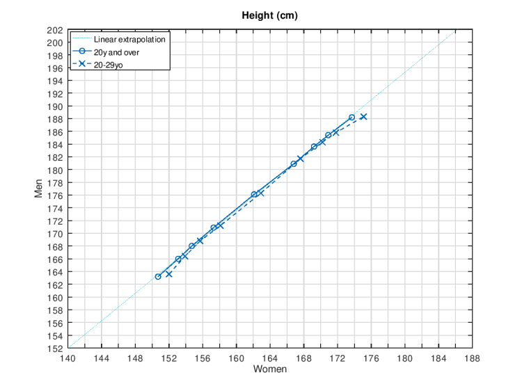
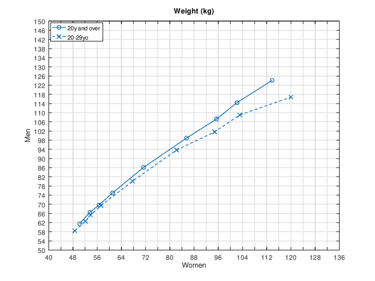
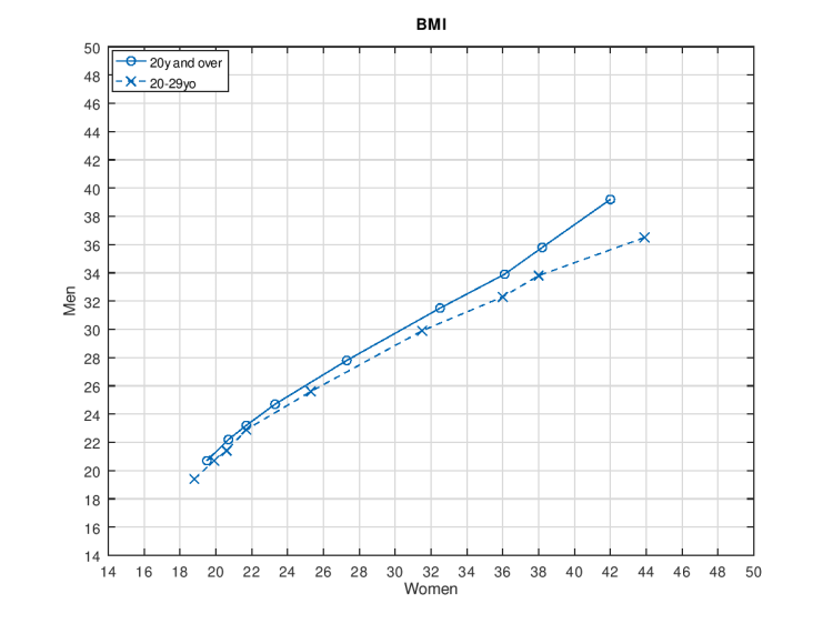
From the above, it should be obvious that my suggestion is that the most harmonious-looking pairs are those where the height or weight or BMI of the man and of the woman are such that a vertical line from the value for the woman intersects a horizontal line from the value for the man at approximately where the blue line is. This solves the problem for the middle 90% of the population.
For the bottom and top 5%, the curves need to be elongated to get extrapolating value pairs. How to do this, I leave open. Exactly because there is no data for them, there is no certainly correct solution.
For the height for the general population, the curve is approximately straight. Therefore I offer an approximating straight line for extrapolation (from the so-called ordinary least squares estimation method of linear regression, with the light blue dotted line). The formula of this line is
heightmale = 1.083 * heightfemale + 0.32 cm.
The most accurate form without the additional +0.32 cm is
heightmale = 1.085 * heightfemale,
and the two curves essentially coincide on the range depicted in the figure.
The height in the 20-to-29-year-old group and both weight curves appear to start steeper for increasing values on the female axis, then flatten out a bit. The BMI curves, which are direct results of the height and weight curves, start steeper, then flatten out a bit (and in the case of the general population, later steepen again).
Assuming heights are normally distributed within a sex, and that 0.5-1% difference in height cannot be distinguished by the naked eye (thereby extending the optimal match from a unique value to an interval), those in the middle have a much larger subpopulation to choose from than the tall ones, who are still in a better position than the short ones. If you think that indistinguishability is purely a question of absolute difference (1-2cm) and not ratios, then in a normally distributed world the short and the tall people are in an identical situation, but the average still have an advantage.2
1C.D. Fryar, Q. Gu, C.L. Ogden. Anthropometric reference data for children and adults: United States, 2007–2010. Tables 3, 5, 9, 11, 14 and 15. National Center for Health Statistics. Vital
and Health Statistics, Series 11, Number 252, 2012.
2One can play around with these concepts here, just allow pop-up windows.
Data analysis and plotting were conducted with the free software package GNU Octave and I am grateful for the opportunity to the Octave development community.
